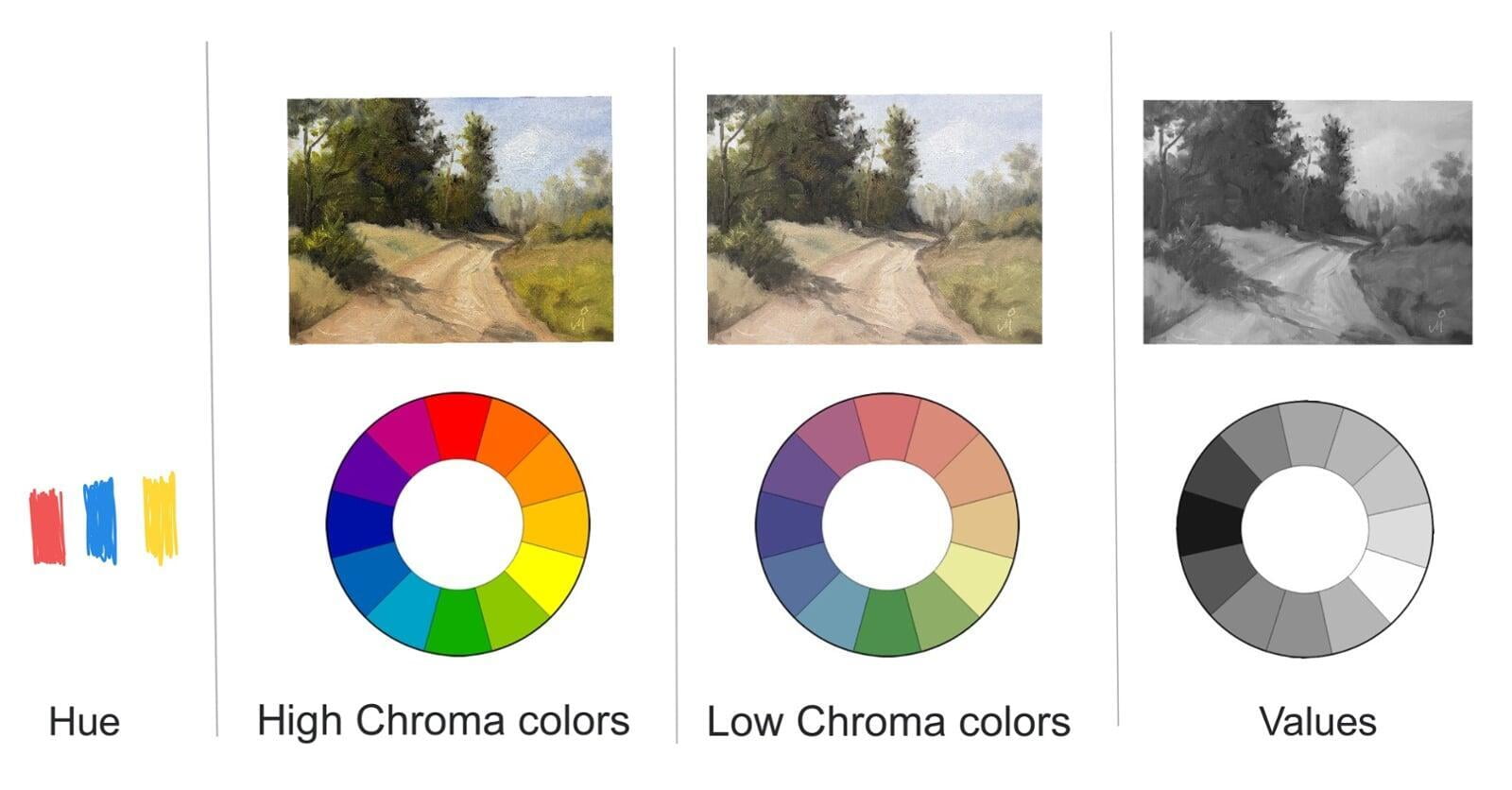
There are many dimensions to color. These Color dimensions help us understand, define and match colors when we paint.
There is color where there is light. It is a simple and a complex subject at the same time. It depends on how deep you want to dig. I'll try to explain few things that I know about colors without going too technical.
If you prefer a more technical explanation, read this.
Origin of Color
All color is light. Light contains different wavelengths of color. Though there are many types of lights sources, I am referring to sunlight here most of the times. I' sure you remember the prism experiment you did in the school to see colors of the rainbow. It showed that sunlight is made of different wavelengths which split into different colors when passed through a prism.
So, if a leaf appears green, it is because it absorbs all other colors from the ambient light and reflects only green. When the same leaf becomes old and looks yellow, it is because it is absorbing different wavelengths of light and reflecting out the yellow wavelengths of light. In other words, the colors of objects are not "in" the objects. They appear to have the color which they reflect.
This also means that color of an object depends on what wavelengths the ambient light contains. Hence, the same object seems to have different color under different lighting conditions such as morning, mid-day and evening. Try photographing an object at different times of day and compare the photos. You'll know what I mean. You'll know that color is relative and not an absolute.
"I can paint you the skin of Venus with mud, provided you let me surround it as I will."
- Eugene Delacroix
Now let's looks at different dimensions of color. There are 4 basic ones.

HUE of color
Hue is what we call "color" in common language. So, when we say apple is red, the sky is blue and so on, we are referring to the "hue" dimension of the color.
VALUE of color
You must have seen old photos that are black and white but you still recognized the objects or people in it. You were able to do this because that photo contained different shades of gray. For example, in a typical portrait shot, hair of the person are darker than his shirt. His skin is lighter than his hair but darker than his white shirt. This relative lightness or darkness of the object is called value of the color. Lemon Yellow is lighter than Venetian red but Venetian red is lighter than Ultramarine blue.
In painting, if the values of different shapes are correct, your painting will look good even if the hues are wrong.
CHROMA of color
Croma is the intensity, purity or saturation of the color. Red of a fresh red apple has high chroma than the red of a 15 days old red apple.
CONTEXT of color
How much ever we may try, matching colors in our painting to colors in nature is impossible. However, the "relative" nature of color makes our task easier.
It is more important that each color in our painting looks correct in the neighborhood of other colors in that painting than how closely each color in our painting matches that in the real world subject of the painting.
So when you are trying to make a painting of an object or a scene and trying to match the colors you see, you need to match all these 4 dimensions. It is a task that requires learning and careful observation. It becomes second nature with practice.
Context is the key here. Now again read Eugene Delacroix's quote given above. It will make more sense.


